My CD Cover
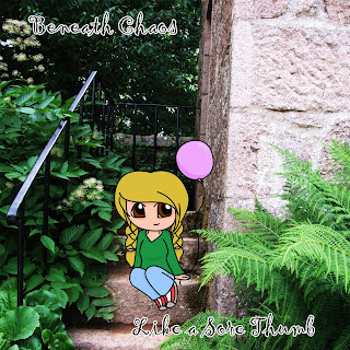
Front
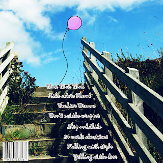
 Back
Back
 The style of my CD Cover is based on alternative music styles such as Mika's Life in Cartoon Motion or Cake Bake Betty's Songs about Teeth. I tried to portray this style by making a CD Cover that doesn't feature the band and instead has something on the cover that you don't see on most Album art.
I made both covers in Photoshop CS4, with my own artwork and photography.
The Front Cover
 I started with a picture of a stone staircase that I had taken at Craigvier Castle in Scotland. I then added another layer.
 On this new layer, I drew a basic sketch of my cartoon character with a Graphics Tablet. I added a layer behind the sketch layer and coloured it in white so that I could see the sketch better.


Then, using the Pen tool, I slowly outlined the rough sketch on a new layer and then stroked the path with a hard brush in black. This created lineart on the new layer which looks much tidier than the original sketch.
I then deleted the rough sketch layer.

I then added another layer and started to colour the picture. I chose bold colours which would stand out again the background so the character wouldn't camoflauge with the background.
After colouring the picture, I added shading to make her look a little more 3D.

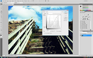
I then selected the background photo layer and adjusted the curves to bring out the colour and constrast.

I then flattened the image and cropped the picture to the appropriate size.
 I then added in some text, my fictional band's name is 'Beneath Chaos' which I got from a Random Band Name Generator.

I then stroked the text in black to make it bolder and to make it stand out better.
 Then I finally added the title of the CD and flattened the whole image, leaving me with the finished piece.
The Back Cover

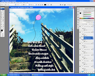
I started with my original picture of some stairs near Smoo Cave in Scotland.

I then Cross Processed the picture and moved the curves.

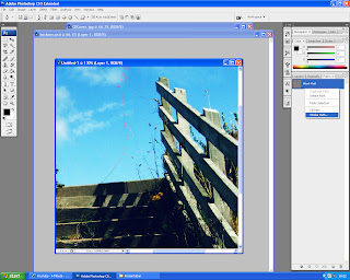
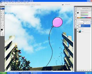
After this, I created a new layer and used the pen tool to draw the cartoon balloon that the character is holding in the front cover, and stroked the path with a number 5 hard brush.

I then coloured and shaded the balloon on a new layer underneath the first.

I then used the same font as before and added the song titles.
With my CD Covers, I am trying to represent the band as fun but different in their style and I think I achieved this with the use of colour, illustration and strange song names.




 This is my front cover, I tried to represent students in the way of bright colours and bold text. I also used pictures to try and make my Cover look appealling.

 Picture by
  Picture by

